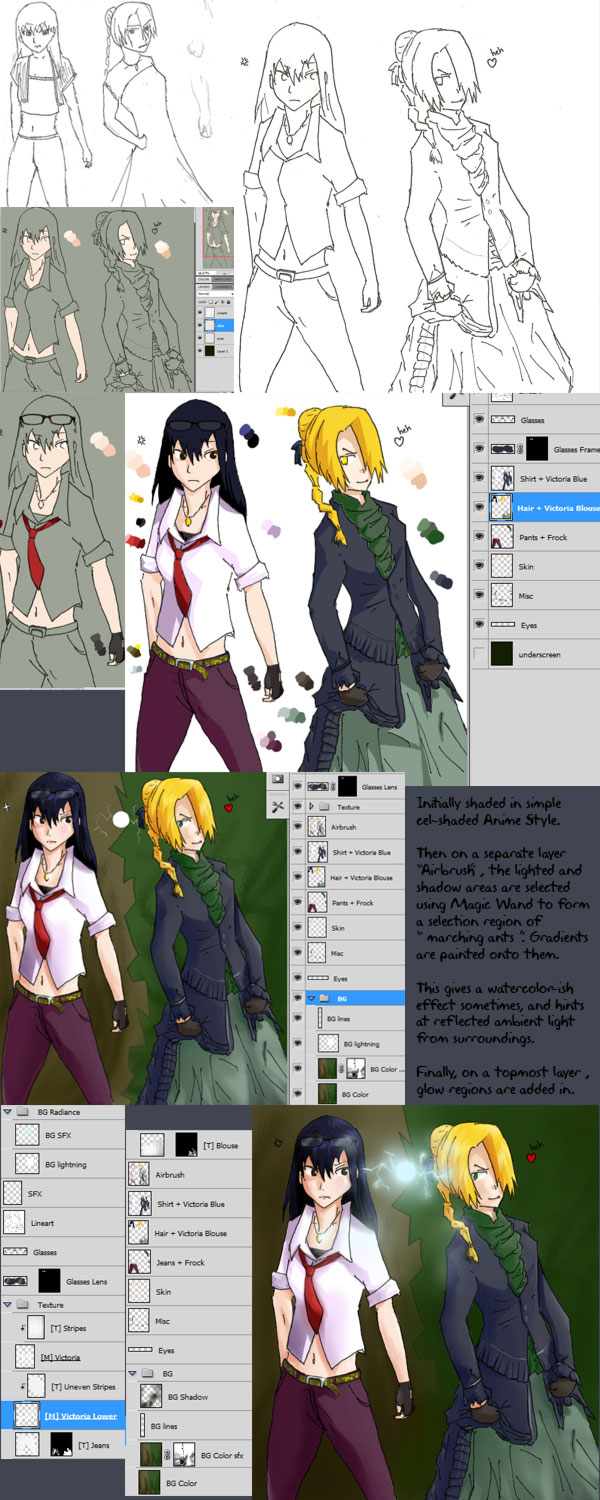
This was the art piece that I was originally gonna sketch 2 weeks ago. But Sakura and Ino (or Naruto characters for that matter) are not in my Top 50 characters, so i didn't really want to sketch this. So that got me thinking what other two female characters have a conflict with each other.
The Concept

 |
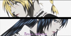
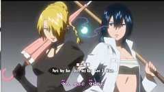
| From Beelzebub Ending 2: Tsuyogari |
Aoi Kunieda and Hildegarde from Beelzebub! My first attempt didn't work out though. You can see how I just pretty much tried to swap the faces and failed badly. :p It took 3 tries before I got it, and even then, if I have to be critical about it, there's something not quite right in the foreshortening of Aoi's torso/hip area and Hilda's frock area. But to get this far without using any anatomical proportions, but on just a gut feel ( pun? :D ) is alright. Anyway it doesn't look anything like the original inspiration piece so I'm pretty happy already.
I felt that I overcompensated for Hilda's underdressed gown though when I decided to put a Victorian outfit on her. She doesn't actually wear Victorian either, but something called Lolita fashion. Well, it has many ruffles too, so close enough. Drawing such a complicated and intricate outfit is refreshing compared to the infinite amount of jeans and shirts one so commonly see, but later on, it was a pain to paint. :(
Anyway, I had to put some more accessories on Aoi to balance the wardrobe, and fortunately it seems to mesh quite well and doesn't look like an out-of-place addition.
The Colouring
Layer Painting
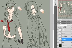
Whether you believe in painting in a single layer like traditional oil painting, or multi-layered digital painting, it's always better to lay down the base colours in multiple layers rather than single layers. It's just faster. For instance, by overlaying the shirt over the frock, I can haphazardly paint in the frock without bothering to stay in the lines.
But beyond that, I was myself quite troubled whether I should later colour everything on the same layer or separate it out. 'Cos I remembered vaguely someone mentioning that by painting on a single layer, all your colours will mesh together to produce a very organic feel to the picture. I foolishly tried to emulate that, having grouped all my colours into a single layer.
But later when I moved onto shading in the colours, I realised it was all too easy to carelessly paint onto other areas. My painting style is very haphazard, a trial and error style; randomly stroking on colours to see if it works, or CTRL-Z undoing it and trying again. Because of that, asking me to paint within the lines was very uncomfortable.
In the end I had to Magic Wand the colours back onto separate layers, but because of the inherent quantum steps of pixels (versus vector) there was a thin layer of alias that bordered the colours, which later required touch-up. :(
Colour Palette
This is the first time I'm painting using a prepared palette instead of continually picking colours on the colour wheel as I paint along. Theoretically, preparing a palette makes sense since it helps gauge the colour balance and ensures bright, lively colours are chosen. For instance, over here I created an array of 4 colours to test which colour looks most extraordinary yet not too ridiculous.
As they say, the best plans always come to naught. Though the intention is good and has a bit of help, the colours sometimes turn out to be wrong. For instance, the Patriarch Purple palette that I chosen was actually a shade too light. I ended up using the darkest shade for the base colour and picked another blackish purple colour as the shadow shading.
The Painting Style I Wanted
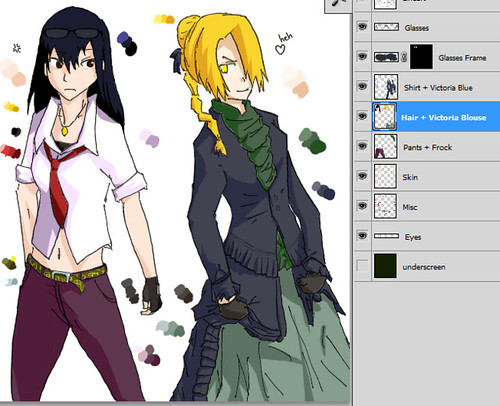
Amongst my 35 deviations submitted, none of them achieved the style that I wanted. I am pretty enamoured of a form of mixed Anime and CGI style. It's like anime style since it emphasises on sharp edges with plenty of contrast. It's also a bit like American comics (Marvel & DC) that uses dark shadows, gradients, and reflected light to show ambience in the picture.
By pure luck I managed to get the effect I want when exasperated, I just decided to paint in a pure cel-shaded Anime style and see how it goes. When I finished that, I actually thought it looked pretty good, especially since it was probably my first pure Anime style artwork, with zero gradients.
Next I had the idea to use the Anime style's shadow and base colour regions as guidelines, and paint gradients solely within that region. By doing that, I could soften the transition between shadow and light, and also add in ambient glows in the shadow region, just like in reality where a shadow can be illuminated by multiple backlight sources.
The Background
I originally didn't have a background planned. Not only after finishing the CGI-ish painting did I reckon the picture was too bright and bland for a white background. I decided to make it like the Ending Theme again, since well, I named the art piece Tsuyogari because it's based off that.
I felt that I overcompensated for Hilda's underdressed gown though when I decided to put a Victorian outfit on her. She doesn't actually wear Victorian either, but something called Lolita fashion. Well, it has many ruffles too, so close enough. Drawing such a complicated and intricate outfit is refreshing compared to the infinite amount of jeans and shirts one so commonly see, but later on, it was a pain to paint. :(
Anyway, I had to put some more accessories on Aoi to balance the wardrobe, and fortunately it seems to mesh quite well and doesn't look like an out-of-place addition.
 |
| Glasses, loose tie, gloves - yeah, Aoi looks more properly dressed now. But for a while I was thinking about adding neon hair highlights, spiked collar, sweat armbands, and studded belt. :@ Though she still got a funky belt in the end. |
The Colouring
Layer Painting
Whether you believe in painting in a single layer like traditional oil painting, or multi-layered digital painting, it's always better to lay down the base colours in multiple layers rather than single layers. It's just faster. For instance, by overlaying the shirt over the frock, I can haphazardly paint in the frock without bothering to stay in the lines.
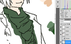
The frock (green area) is overlaid by the nicely painted victorian blue region.
But beyond that, I was myself quite troubled whether I should later colour everything on the same layer or separate it out. 'Cos I remembered vaguely someone mentioning that by painting on a single layer, all your colours will mesh together to produce a very organic feel to the picture. I foolishly tried to emulate that, having grouped all my colours into a single layer.
But later when I moved onto shading in the colours, I realised it was all too easy to carelessly paint onto other areas. My painting style is very haphazard, a trial and error style; randomly stroking on colours to see if it works, or CTRL-Z undoing it and trying again. Because of that, asking me to paint within the lines was very uncomfortable.
 |
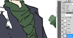
| The colors were consolidated into a single layer called "Colors". Silly of me. |
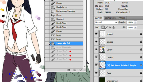
In the end I had to Magic Wand the colours back onto separate layers, but because of the inherent quantum steps of pixels (versus vector) there was a thin layer of alias that bordered the colours, which later required touch-up. :(
 |
| And the colors were later Magic Wand-ed back into different layers. But you can see a border of alias pixels around the frock area & Hilda's gloves where the Magic Wand was ineffective. That had to be touched-up later. |
Colour Palette
This is the first time I'm painting using a prepared palette instead of continually picking colours on the colour wheel as I paint along. Theoretically, preparing a palette makes sense since it helps gauge the colour balance and ensures bright, lively colours are chosen. For instance, over here I created an array of 4 colours to test which colour looks most extraordinary yet not too ridiculous.
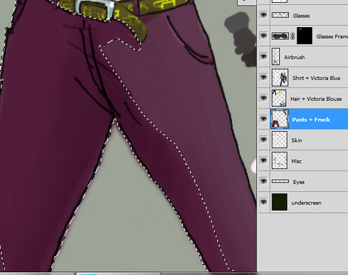
|
| At Aoi's jeans, I prepared 4 different shades of indigo and purple to see which fit. In the end I went with purple, since indigo was too bluish; Hilda's victorian dress was already so blue! |
The Painting Style I Wanted
Amongst my 35 deviations submitted, none of them achieved the style that I wanted. I am pretty enamoured of a form of mixed Anime and CGI style. It's like anime style since it emphasises on sharp edges with plenty of contrast. It's also a bit like American comics (Marvel & DC) that uses dark shadows, gradients, and reflected light to show ambience in the picture.
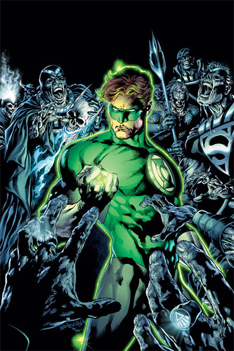 |
| The gradients soften the sharp contrast areas, and there's a heavy dosage of very saturated colours and balanced luminosity. I think the movie Green Lantern is underpromoted though, come on, a Pepsi and Essence of Chicken advert?! How are they gonna follow up with a Justice League movie now, compared to The Avengers?! |
|
| A pure Anime style with no gradients. |
 |
| Magic Wand to select a region, which serves as a mask for painting gradients in the "AirBrush" layer. |
The Background
I originally didn't have a background planned. Not only after finishing the CGI-ish painting did I reckon the picture was too bright and bland for a white background. I decided to make it like the Ending Theme again, since well, I named the art piece Tsuyogari because it's based off that.
Fortunately the colour balance still looked alright after adding in the background, presumably because I was working with a pale green underscreen background the whole while, hence the colour palette was compatible. This is also probably another reason why backgrounds should always be painted in first, so that any other colours in the foreground will be compatible and mesh well with the background.
There was a minor issue though, that is not immediately apparent even now. There's two light sources in the final picture: an offscreen sunlight glow in the top-right corner, and the 360degree sun flare at the center. Because the sunflare was decided so late in the painting, Hilda was painted facing the wrong light source. The sunflare was brighter than the offscreen sunlight, so Hilda's back should have been illuminated, and her front shadowed. Instead it's the other way round. But by some fortune it still looks convincing enough. Thankfully.
Well that's that. Tsuyogari, featuring Aoi Kunieda and Hildegarde from Beelzebub.
No comments:
Post a Comment